Passing WCAG alone does not mean reading comfort.
Higher contrast triggers the halation effect (glowing halo bleeding out from the edges of text).
A visual and UX audit of the DistroWatch website, and a redesign to make it easier to read and scan over long sessions.
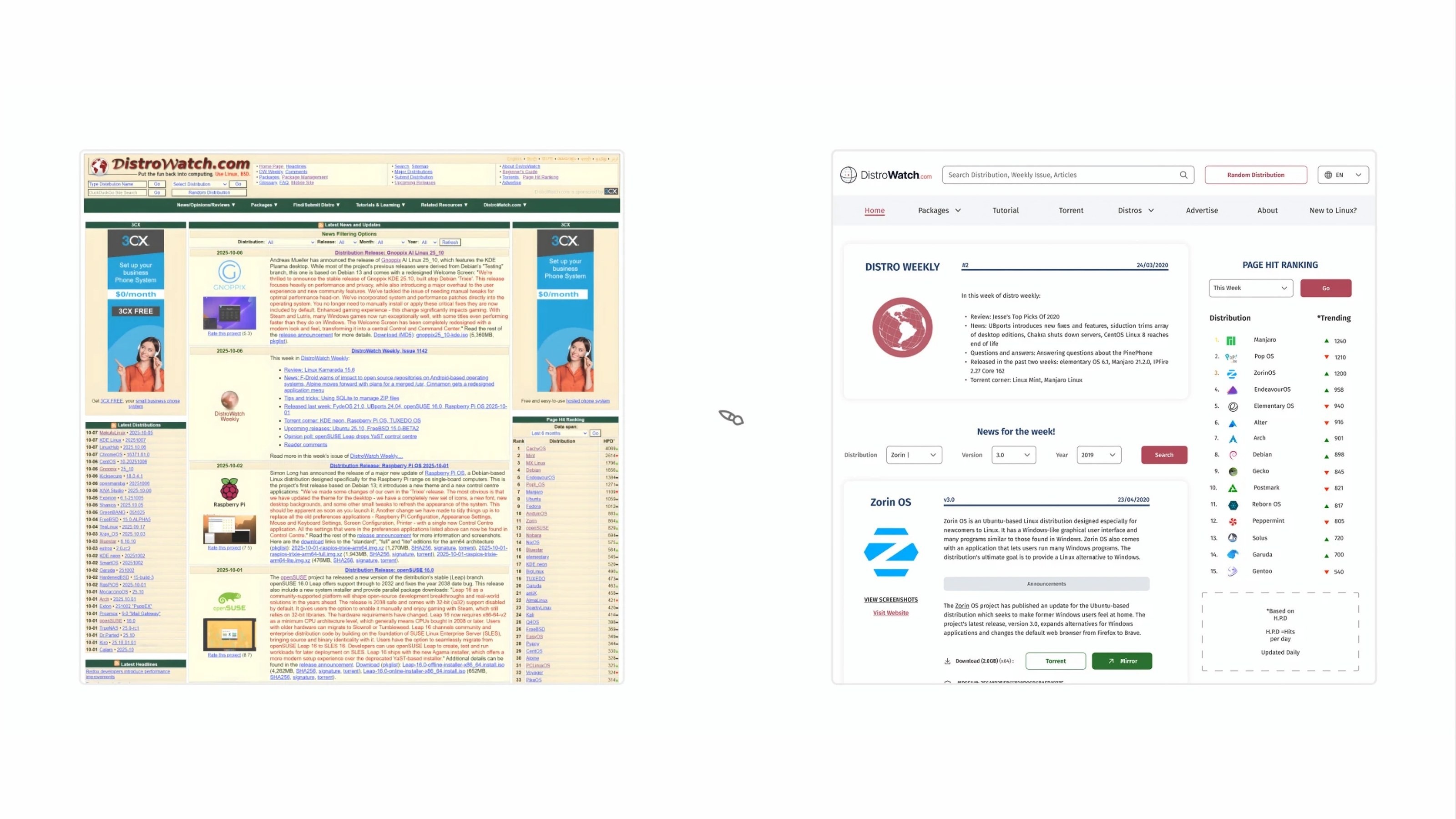
DistroWatch is a content-heavy website used by the Linux community to track distributions, releases, and package updates. While it is functionally rich and widely used, the visual experience often feels overwhelming during regular use.
As a daily Linux user, I found myself struggling to comfortably read and scan the site over longer sessions. This audit began as a personal attempt to understand why the experience felt fatiguing, and how visual design decisions around spacing, typography, and color contribute to that feeling.
This audit focuses on readability, visual and perceptual UX issues, which it does in four categories.
Colors
Discusses WCAG and legibility vs readability
Spacing
Discusses line-height, spacings and margins.
Typography
Discusses kerning, legibility, weight-control, apertures, rhythm, ambiguity
System-Level UX Issues
Discusses general usability issues
There isn’t enough breathing space for eyes.
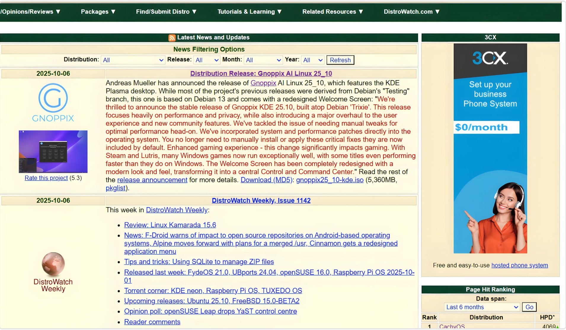
This makes the website feel tight and gives it a condensed layout.
The website’s cramped layout causes:
Ultimately making it hard for users to read and scan over prolonged periods of time.
The optimal line-height should be around 1.4x to 1.6x the size of the font. However, in this case, it is just 1.15x, which is nowhere near the optimal height.
Look at the two images below. Which one feels easier to read?
Default (1.15x)
“The AnduinOS team has announced the release of AnduinOS 1.4.0, the latest version of the project’s Ubuntu-based Linux distribution that offers a familiar and easy-to-use experience for anyone moving to Linux. The new version is based on Ubuntu 25.10 and uses GNOME 49 as the preferred desktop.”
Improved (1.50x)
“The AnduinOS team has announced the release of AnduinOS 1.4.0, the latest version of the project’s Ubuntu-based Linux distribution that offers a familiar and easy-to-use experience for anyone moving to Linux. The new version is based on Ubuntu 25.10 and uses GNOME 49 as the preferred desktop.”
Excess use of high-saturation color pairings (contrast) causes rapid visual fatigue. The table shows the combinations along with the saturation of the foreground color:
Passing WCAG alone does not mean reading comfort.
Higher contrast triggers the halation effect (glowing halo bleeding out from the edges of text).
Look at both texts for a few minutes. Which one hurts the eye more? (P.S. They both have the same properties.)

On a site designed for frequent reading and scanning, constant exposure to intense colors increases visual fatigue and reduces reading comfort.
Higher Contrast = Higher Visual Volume = Higher Visual Difficulty over a long period of time
I have reduced the background noise to highlight the foreground visual noise created by strong colors.
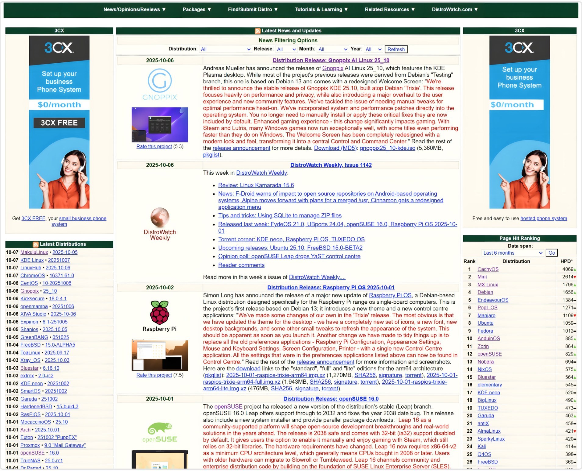
Using low-saturated colors for lower contrast.
Arial is used as the default typeface which lacks clarity, hierarchy, rhythm and reading comfort.
Solution would be to use a typeface which is legible, clear and easy to read like Fira Sans.
The table below compares and illustrates why Arial fails here:
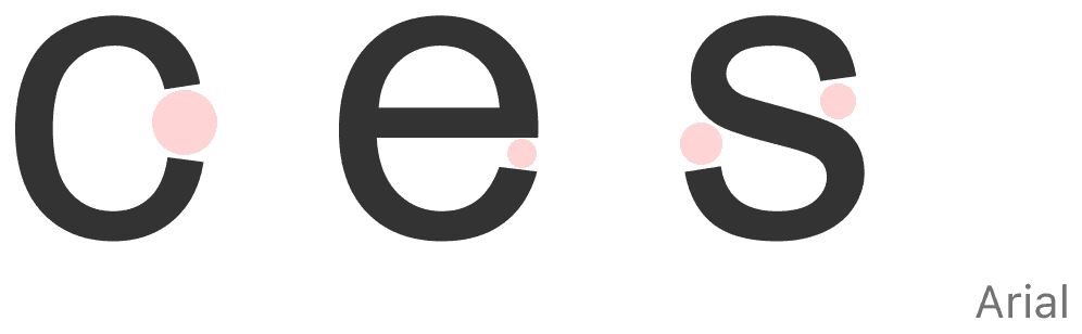
Arial’s narrow apertures collapse at small display scales, causing glyph shapes to merge, which impairs character recognition and increases eye strain.
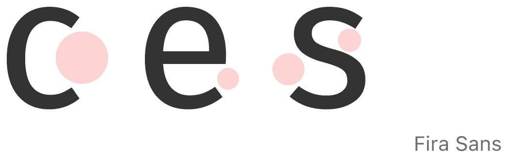
Fira Sans has open, bigger apertures which help character recognition, ensuring a comfortable and accessible reading experience even at small sizes.
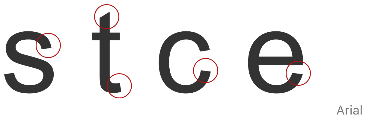
Arial’s slanted terminals create irregular stroke terminations that disrupt the horizontal baseline rhythm, forcing frequent ocular adjustments and increasing reading effort.
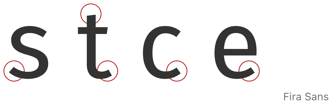
Conversely, Fira Sans utilizes horizontal terminals aligned to the reading path, establishing a stable visual rhythm that reduces tracking fatigue.
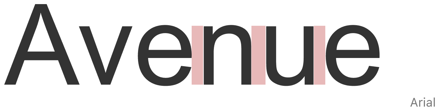
Arial’s non-uniform kerning pairs disrupt letter-spacing consistency, which delays word recognition and creates an irregular reading rhythm.
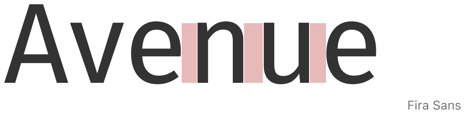
Compared to that, Fira Sans kerning is much more consistent.
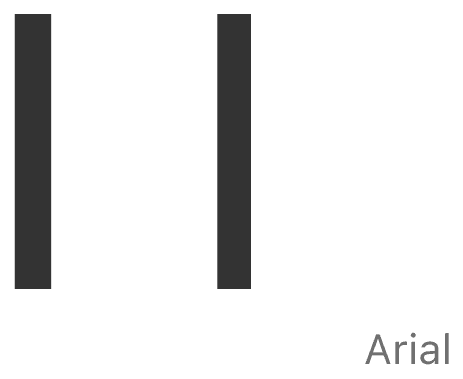
Can you guess which is small L and capital I? Arial’s lack of distinction between letters leads to misinterpretation of data, causing user frustration and errors.
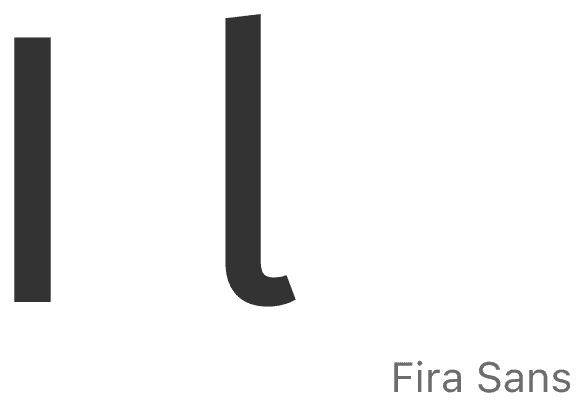


More weights mean more control over contrast and visual hierarchy.
Arial offers limited weight options compared to Fira Sans, which makes it harder to control hierarchy.
Interaction and navigation failures increase user cognitive load and reduce operational efficiency. The updated Information Architecture (IA) resolves these structural usability issues.
Redesign comparison has been done to show what is fixed.

Multiple menus increase interface clutter and cognitive load.
Search-bar redundancy problem similar to menus.
No search suggestions or feedback while typing.
Users receive no confirmation that their content exists, increasing doubt and mental effort during search.
No hover or interaction feedback.
Users would not be able to tell what is interactive or not, causing uncertainty and reducing confidence while navigating.
Navbar inaccessible while scrolling.
As users scroll through long pages, the navigation bar, which connects pages, disappears. This forces them to scroll back up to change sections, increasing effort and breaking reading flow.

1, 5
A single menu reduces on-screen clutter. A persistent navigation bar follows the user during scrolling, providing continuous access to menu items from any position on the screen.
2, 3, 4
Reducing search menu choices while improving functionality would minimize cognitive load, increase user efficiency and reduce task completion time.
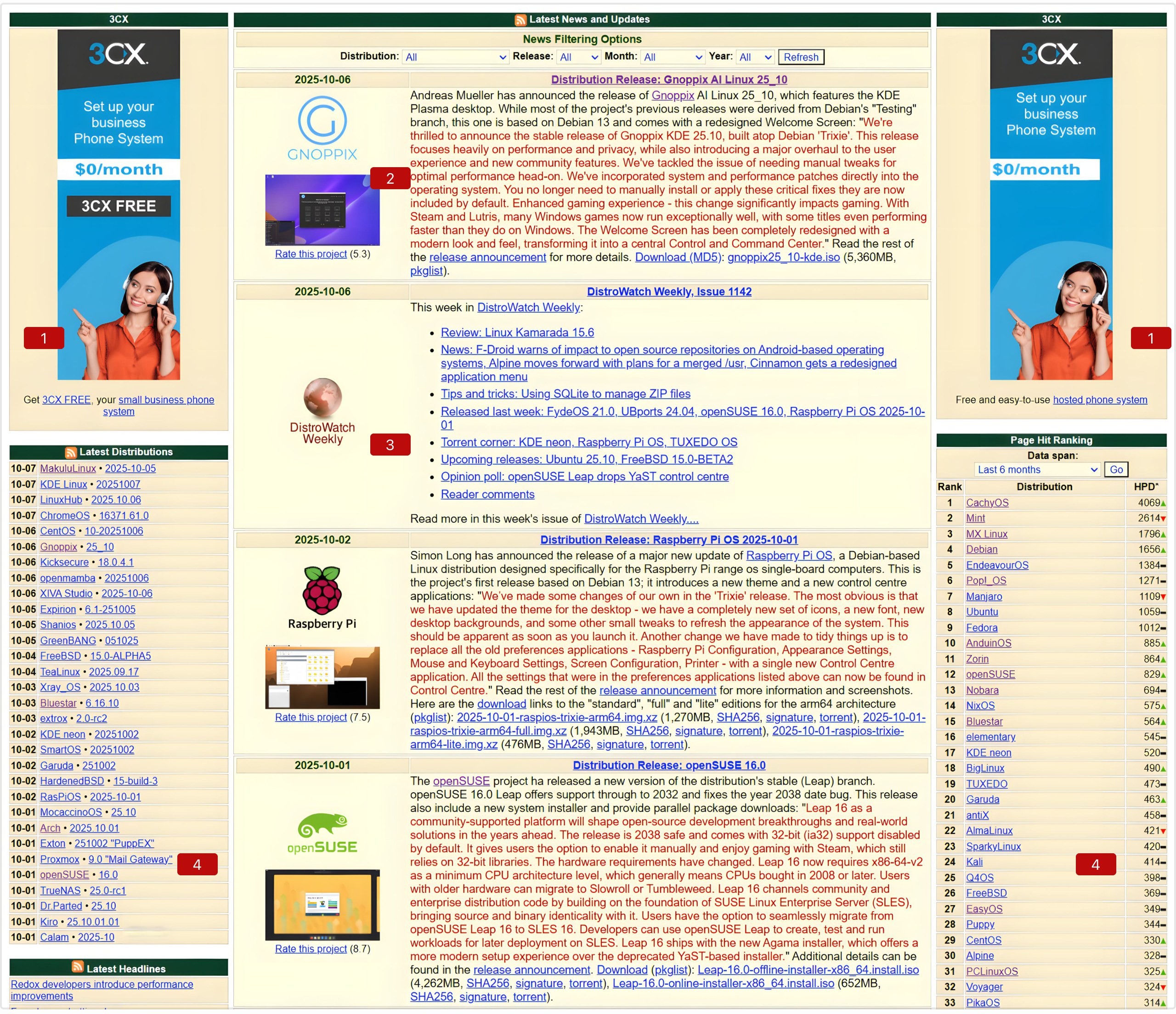
Animated videos on both sides
Animated advertisements introduce constant motion that continuously captures focal attention, diverting user focus away from core content.
Suboptimal line length
For a comfortable reading experience, the total number of characters in a line should be around 45 to 75. DistroWatch clearly breaks the rule, making it taxing to read the content.
The primary weekly newsletter is mixed into the standard distribution news feed, making it difficult to distinguish between content types.
Multiple menus increase interface clutter and cognitive load.
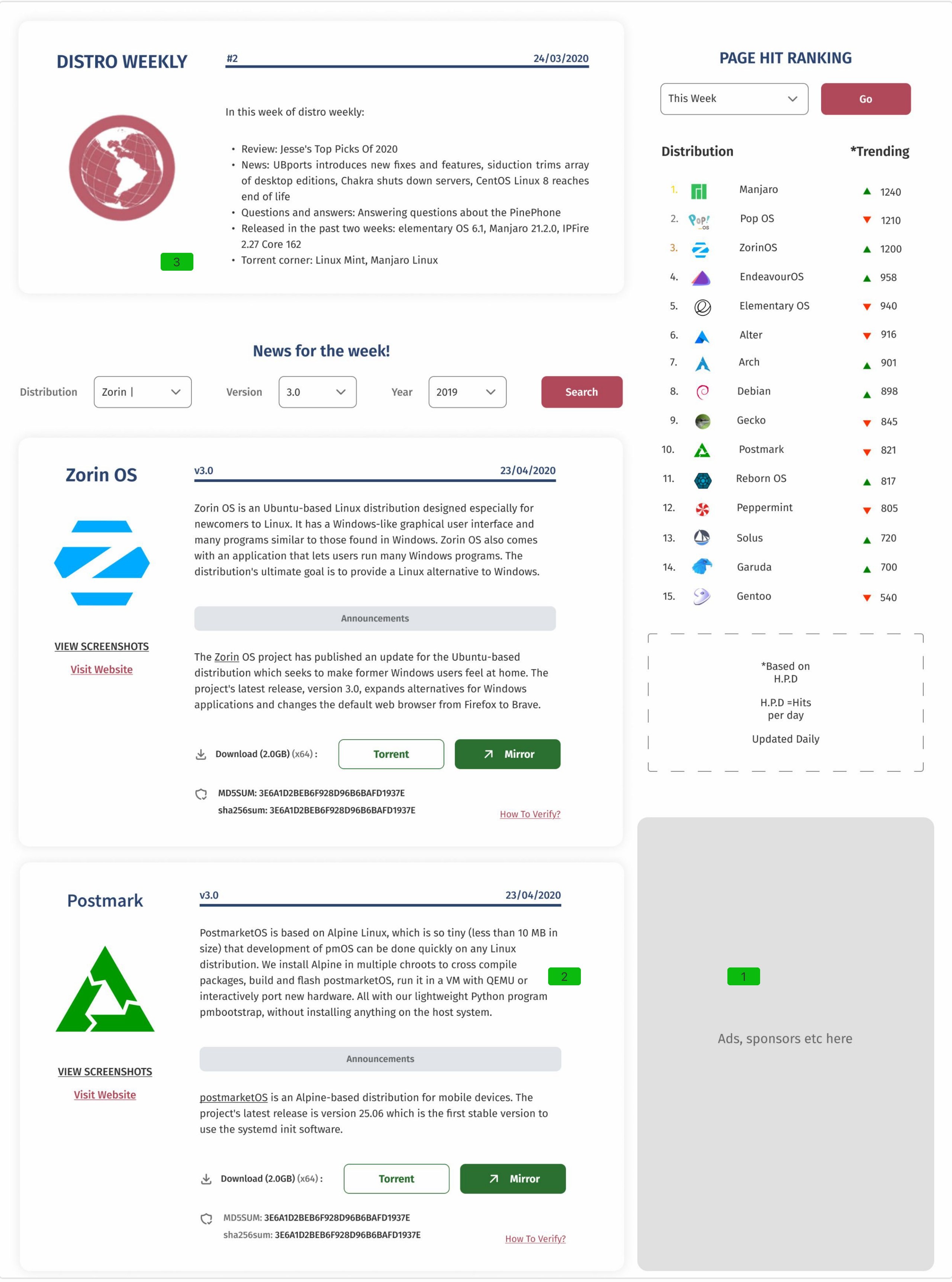
1, 4
Reconfiguring the layout prioritizes the main content over advertisements and peripheral links, establishing a clearer visual hierarchy and improving readability.
2
Fixed the word count on each line for a better reading experience.
3
Organizing content gives each section a priority and reduces the effort to find data.
Layout updates improve the overall information hierarchy and presentation for better structural clarity.
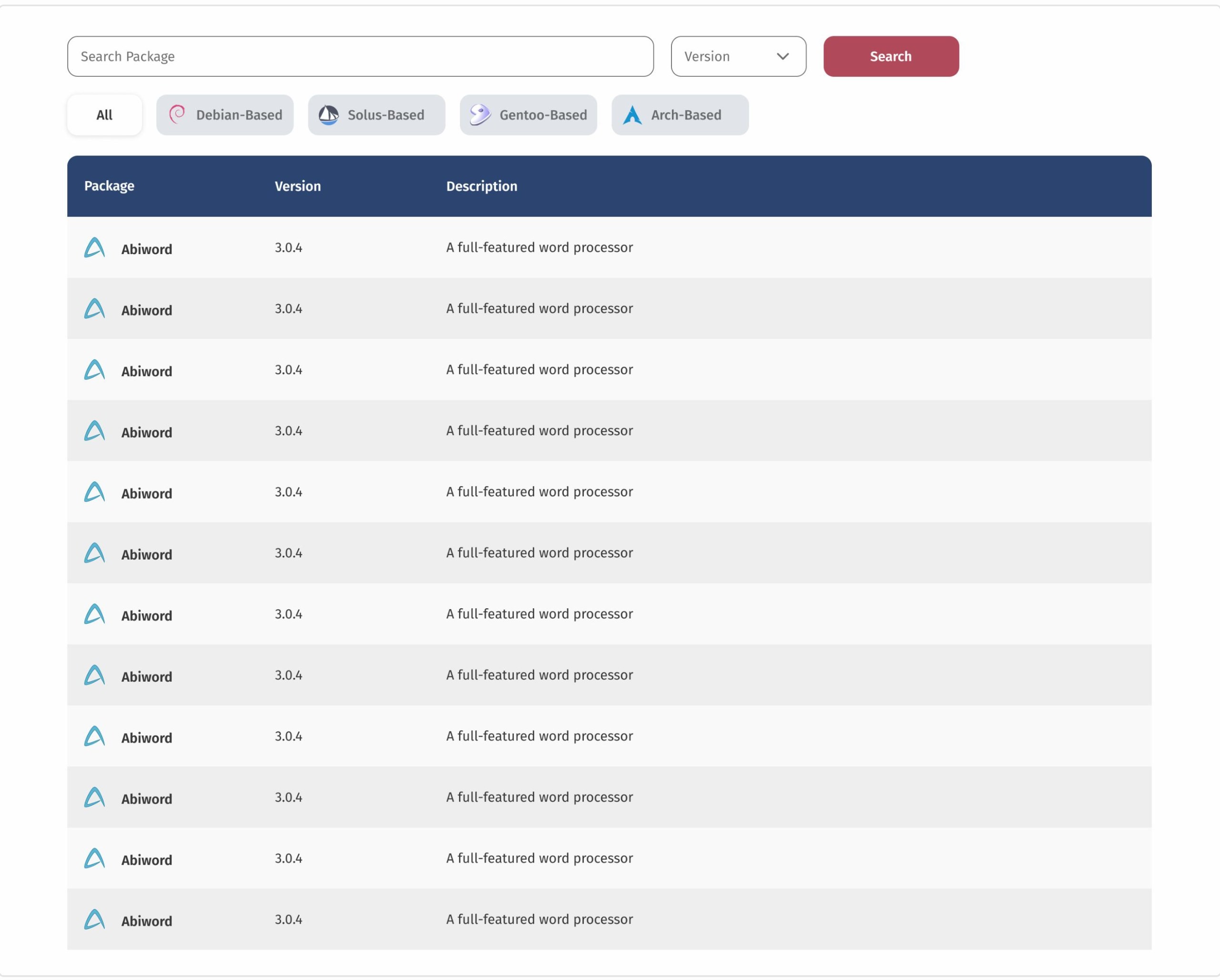
Users have to scroll long tables and lists to find their data. This could slow down users. There are two variants of this problem, shown in the images.
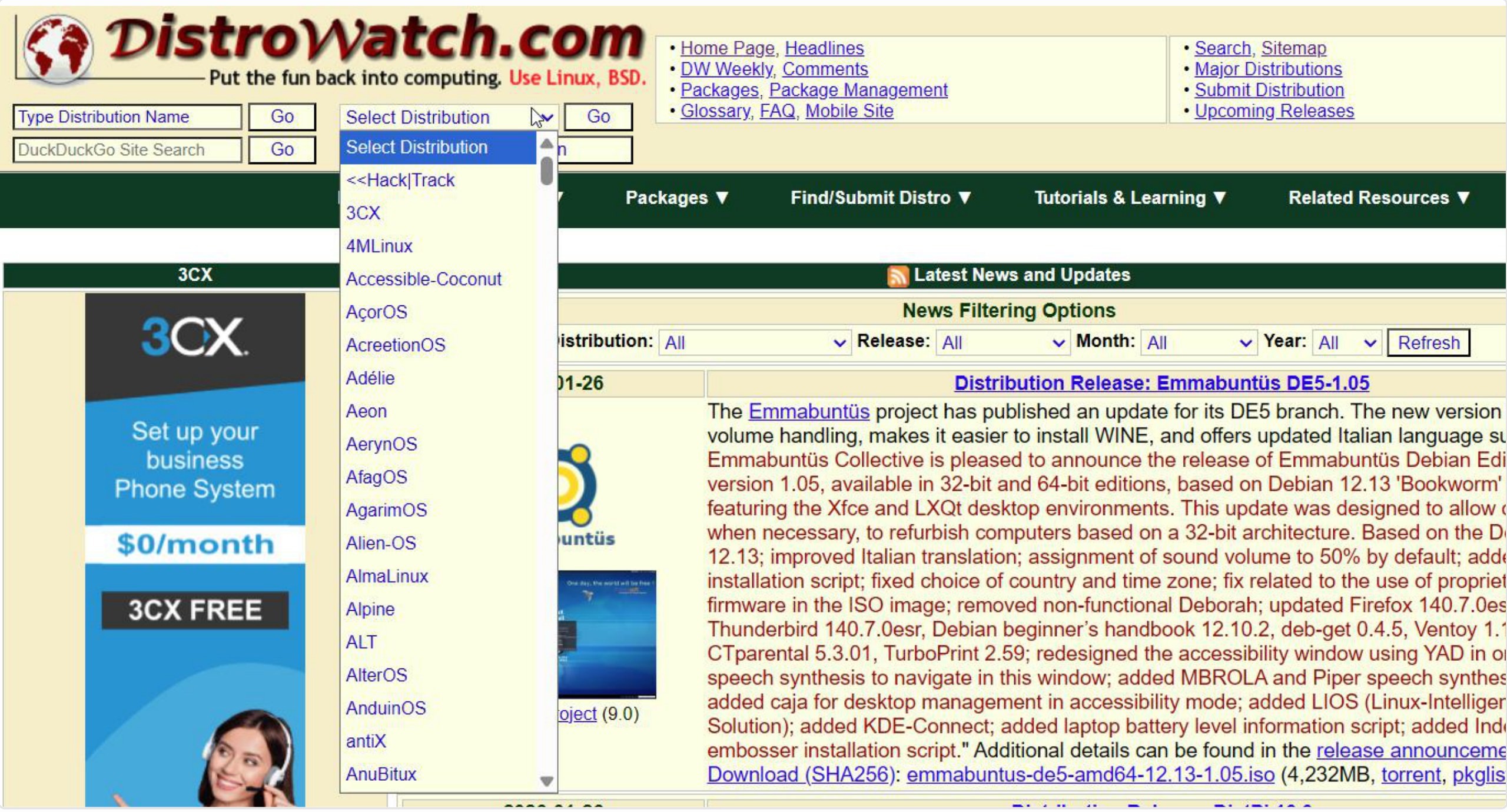
List tabs with dropdowns do not have typing support. Having one is going to help finding information more efficiently because it would save time, allowing users to search instead of scrolling a long list.
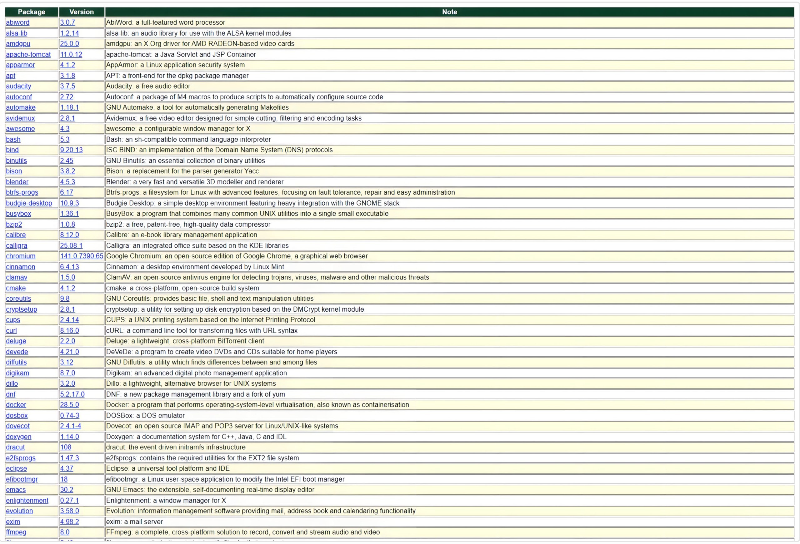
Similar concept, different form.
Having a search bar would help users search from a long list of data.
Users lose their progress while navigating when links open in the same page, which could be frustrating.
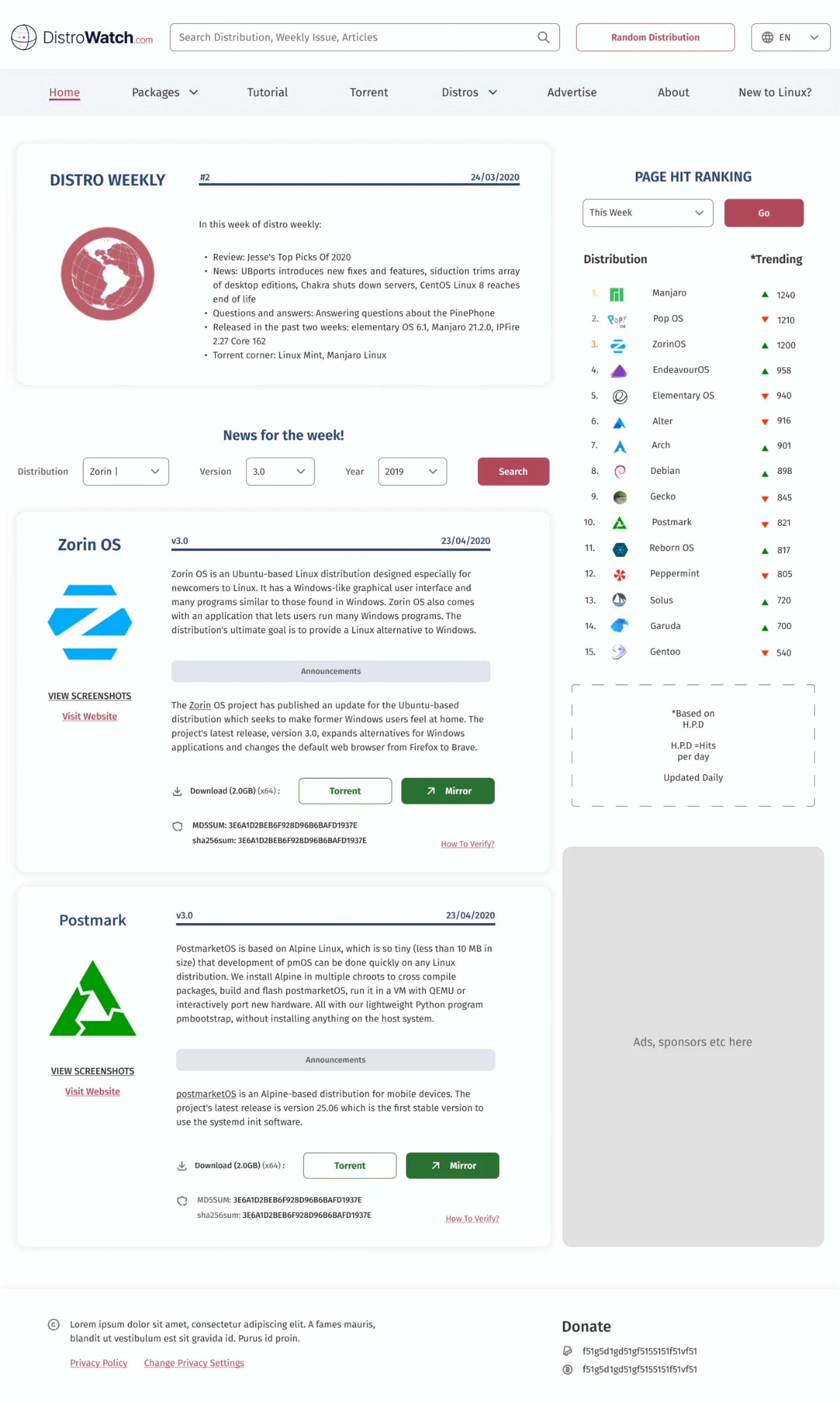
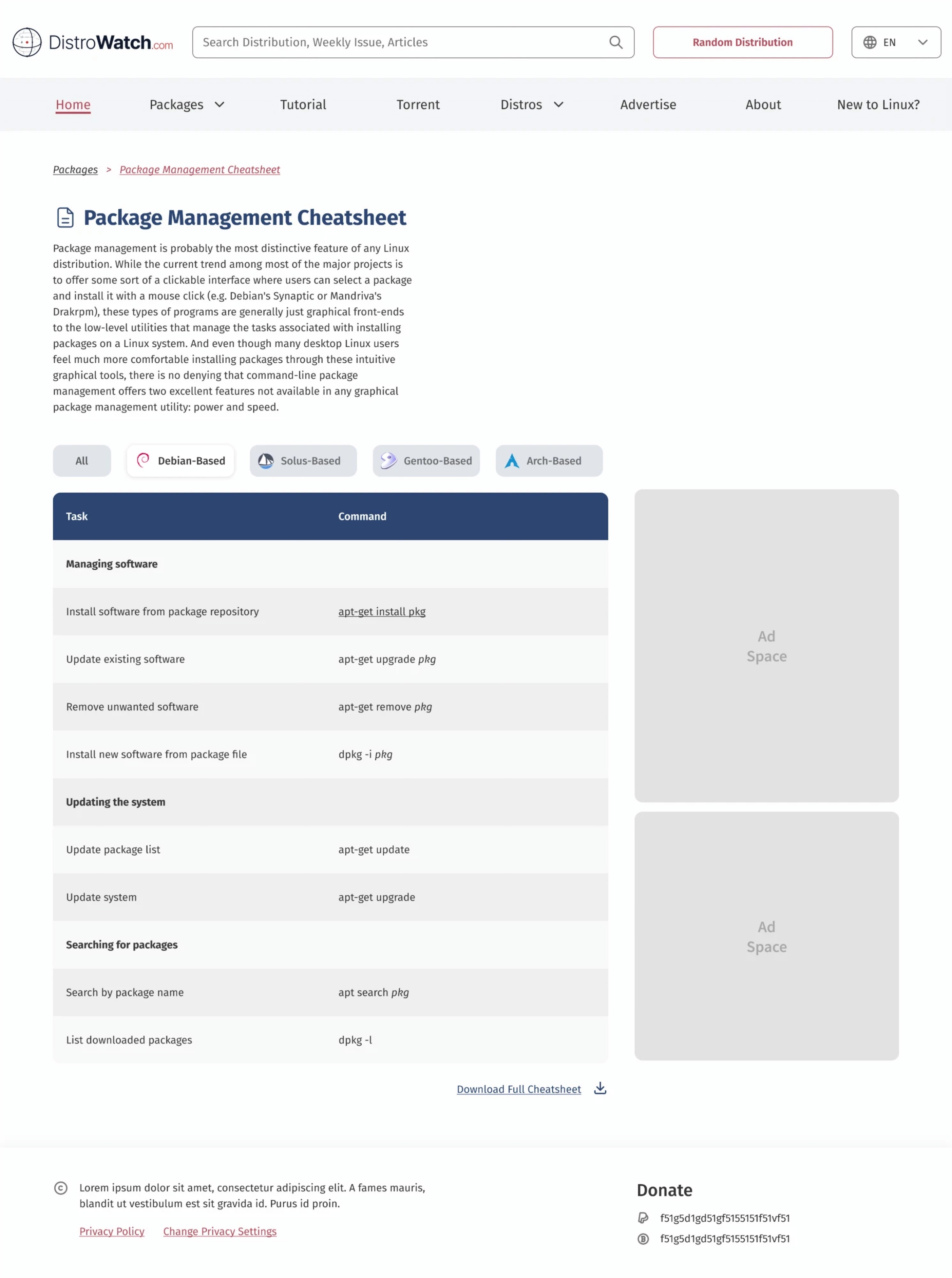
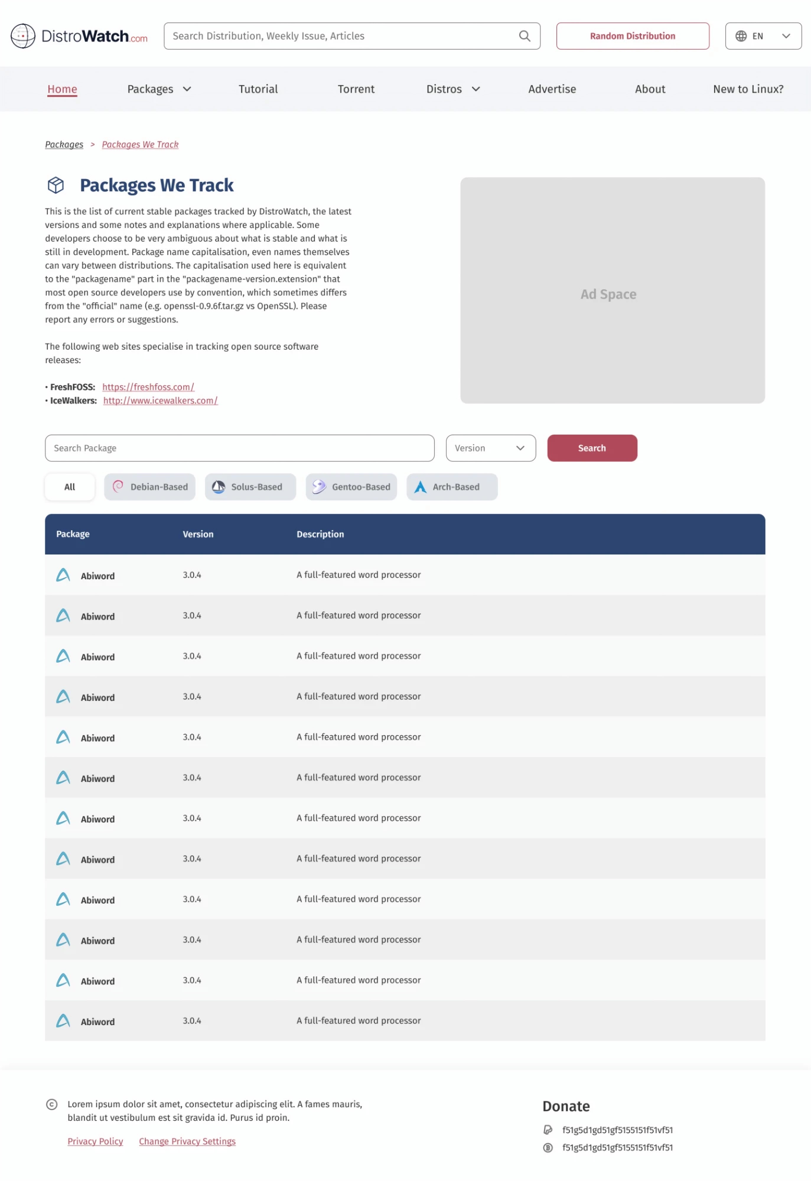
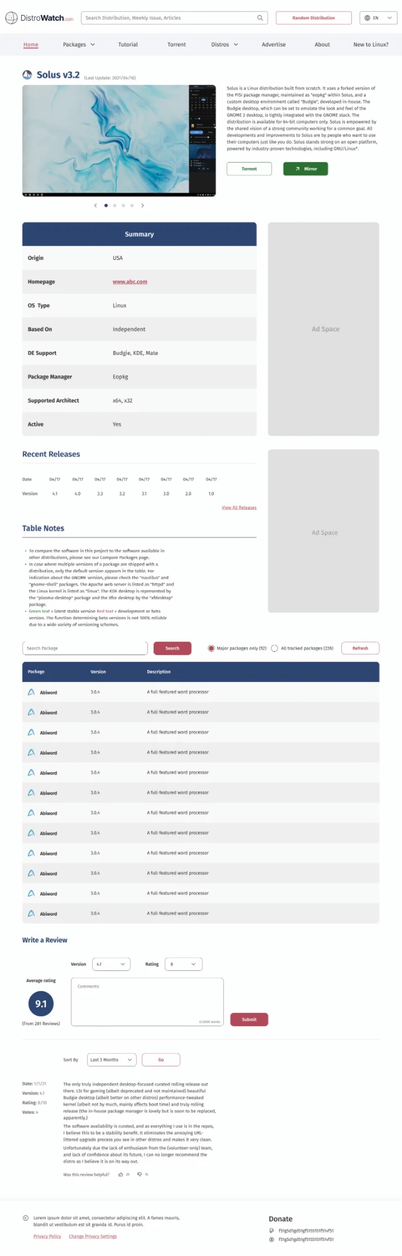
The screens I designed.